It was during the first year of the pandemic and after three months of lockdowns, restrictions were somewhat lifted, and my friend and I were ready to relish a bit of freedom. During the early morning ferry ride to Ward’s Island, Toronto, the bracing wind served to awaken me in a way coffee never did. I was anxious to slough off the inertia and creeping depression that came with restrictive lockdowns and little to no human contact for those three months. I was glad though, to have my work to keep my mind busy.
Once we had disembarked from the ferry, I was anxious to get close to the water and the trees and…well, just nature in general. I had never been to Ward’s Island before and did not know what to expect. It’s a calm little paradise off the mainland, especially if you get to the island early in the morning before the inhabitants are truly awake and definitely before the late morning and afternoon crowd descends.
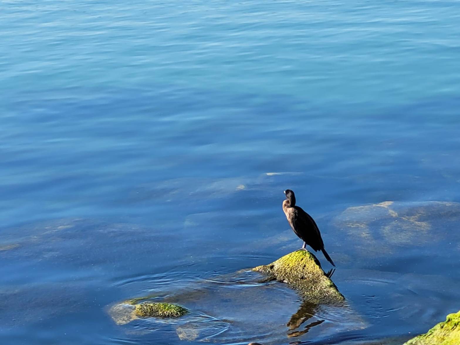
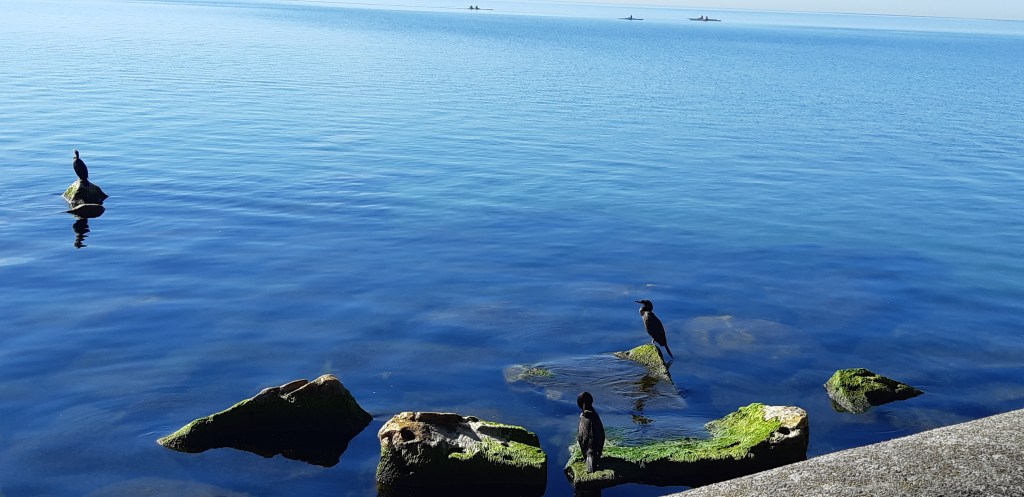
After taking many charming photos of the various flora and fauna, we began our stroll along the boardwalk from Ward’s Island to Centre Island, that’s when I spotted it – a bird upon the jut of a rock or boulder which was mostly submerged in the water a few metres away from the wall. It stood there looking out to the horizon as if deep in thought or looking for something or perhaps a fellow feathered friend. What struck me the most was that right behind it were its comrades who were busily primping and preening in the early morning sun. But my bird wasn’t bothered with all of that. I couldn’t help it. I just had to take a photo to immortalize that moment. I took several. I would later find out that the birds were double-crested cormorants.
I felt a certain kinship with my cormorant because I too have sometimes found myself detaching from my friends to just ‘be’ in the moment with my own thoughts. If birds had thoughts, I wondered what they were.
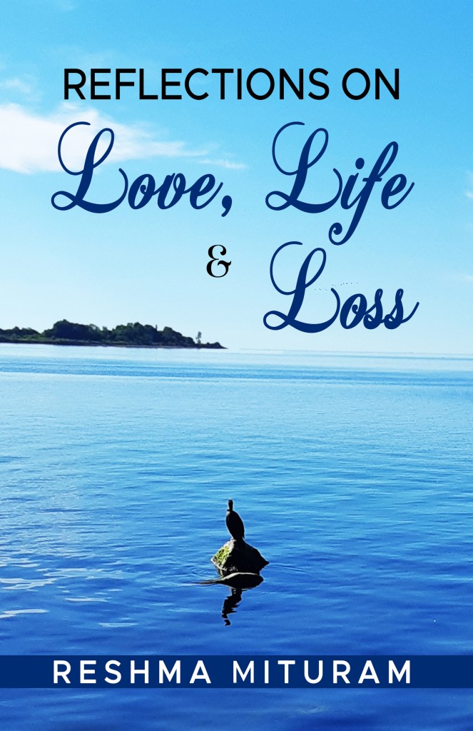
Cut to a couple of years later and I wanted a cover that reflected the contents of Reflections on Love, Life & Loss. The photos I took on that day were stored in my archives and as I was scrolling through them, I almost scrolled past. I stopped, opened it bigger on my laptop screen and it immediately clicked. It was perfect. Of course, I cropped out the others so it would just be my cormorant and its reflections on whatever was going on in its life and of course, it was all blue – my favourite colour.

A pensive mood. Thinking great thoughts?
The colour blue is associated with peace and serenity. It invites us to reflect and to find peace within. Because we often perceive the sky as blue, the colour is also associated with the divine and expansion (the sea and the sky).
Blue has great significance in many cultures as well. In Sanatan Dharma (Hinduism), Lord Krishna is depicted as being blue signifying divinity and infinity, so is Lord Shiva whose throat is also blue. In dharmic texts, Lord Shiva consumed the deadly Halahala poison which emerged during the churning of the sea. This poison would have destroyed all life and because there was no way of destroying the poison without destroying every living thing, he consumed it. His wife, Parvati, in a bid to keep him from being destroyed by its potency, stopped the poison at his throat. That’s why Lord Shiva is also called Neel Kanth (the one with the blue throat or blue throated one) symbolising Shiva’s sacrifice for the welfare of all. If this tidbit made you interested in knowing more, you can go to the Isha Foundation (Sadhguru’s blog) where it is posted here: https://isha.sadhguru.org/mahashivratri/shiva/shiva-blue-throat/.
Blue is symbolic of communication and truth and is linked to the throat chakra which governs self-expression.
Ancient Egyptians used lapis lazuli in their protection amulets as do Native Americans who use turquoise stones for protection and healing. The Virgin Mary’s robes are blue signifying purity and also divinity. Mosques also have blue domes as a symbol of peace and tranquility.
I can think of no better colour for my first book, a collection of poetry which invites the reader to reflect on three states of the human condition.
Reflections on Love, Life & Loss is the first edition of my first published collection, and I am proud of it. Can it be better? Absolutely, and I will eventually complete the second, much improved, edition.
What do you think? Is it a suitable cover? Is it easy on the eyes? Are you drawn to it? Does it give you a sense of serenity? Feel free to give your thoughts in the comments and subscribe for more blogs on my journey as an author and indie-publisher.
Have a lovely day!
